


Why unexpected color combinations are so appealing !
- Jun 29
- 2 min read
Color psychology expert Kate Smith says our eyes are naturally drawn to contrast because it helps us make sense of the world. When two different colors are paired thoughtfully, neither overpowers the other—instead, each makes the other appear richer and more vibrant. This creates visual excitement without feeling chaotic.
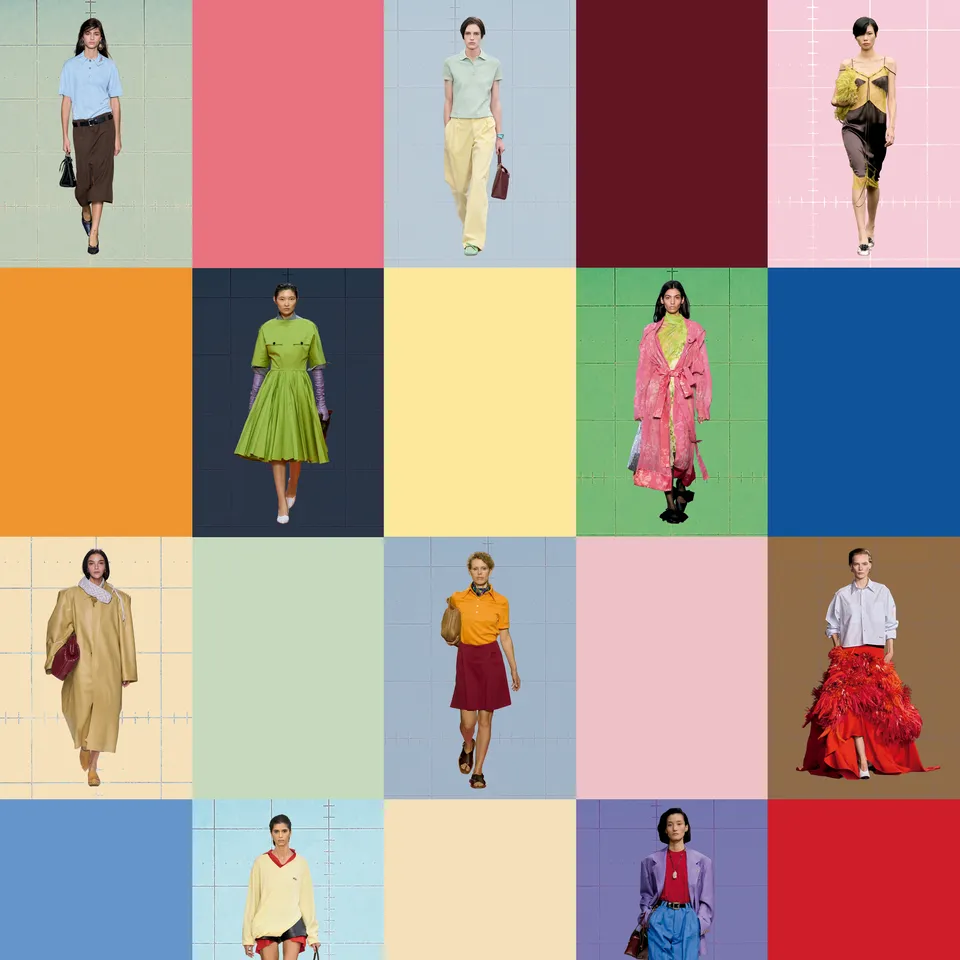
Clinical psychologist and image coach Domingo Delgado adds that contrasting colors create a kind of visual "tension." One color may feel energetic while the other feels grounding, creating a dialogue that keeps the viewer's attention. Wearing these combinations can also psychologically encourage creativity, flexibility, innovation, and authenticity.
Fashion is moving beyond predictable palettes
The article highlights several runway examples showing how luxury brands are challenging traditional color rules:
Baby blue paired with vivid red (seen at Chanel and worn by Lady Gaga).
Pastel yellow combined with mint green at Dior.
Mandarin orange with burgundy at Miu Miu.
Lime green with chocolate brown at Ferragamo.
These combinations may initially seem unusual, but they succeed because they balance contrast rather than compete for attention.
Color as a statement of identity
The article argues that today's interest in bold color combinations reflects a broader cultural desire for individuality.
In a world saturated with images, people want to express personality without abandoning elegance. Designers are offering new ways to stand out through color rather than relying only on silhouettes or logos.
The return of color blocking
One major trend discussed is color blocking—wearing large areas of contrasting solid colors together.
Kate Smith explains that color blocking has roots in Modernist art and recalls Yves Saint Laurent's famous Mondrian dresses. Rather than being accidental, these combinations communicate confidence and intention.
Leatrice Eiseman, Executive Director of the Pantone Color Institute, says choosing striking color combinations can make the wearer feel empowered while projecting confidence and authority.
Quiet luxury is becoming more colorful
The article also notes that minimalism isn't disappearing—it is simply evolving.
Instead of wearing only beige, cream, gray, or black, designers are introducing richer accent colors into otherwise understated wardrobes. Examples include:
Beige with deep burgundy.
Black with pale yellow.
Neutral palettes energized with carefully chosen saturated tones.
These combinations preserve elegance while adding personality and emotional depth.
Why Sanzo Wada matters today
Although Sanzo Wada published his color guides nearly a century ago, his work feels remarkably contemporary.
The experts believe his recent popularity isn't accidental. In an era of endless visual inspiration and overwhelming choice, Wada's carefully balanced palettes provide a reliable framework that encourages experimentation without feeling random.
Rather than prescribing strict rules, his books encourage people to expand their "color vocabulary" by discovering combinations they might never have imagined on their own.
Conclusion
The resurgence of Sanzo Wada's work reflects a broader shift in fashion and design: people are looking for thoughtful creativity instead of rigid rules.
Unexpected color combinations work because they create balance through contrast, stimulate visual interest, and allow individuals to express confidence, originality, and personal style. Wada's palettes aren't meant to be copied exactly—they're meant to inspire experimentation and help people see color in entirely new ways.


Comments